|
|
Post by sherrylynne on Nov 28, 2010 22:03:20 GMT -5
The good, the bad, and the ugly  This is my first attempt at a water colour in about 3 years. I do it just for my own pleasure, but would like some critiques on it so I can improve my technique! It's not meant to be a replica of the picture, but my own interpretation of it  Painting and photo side by side 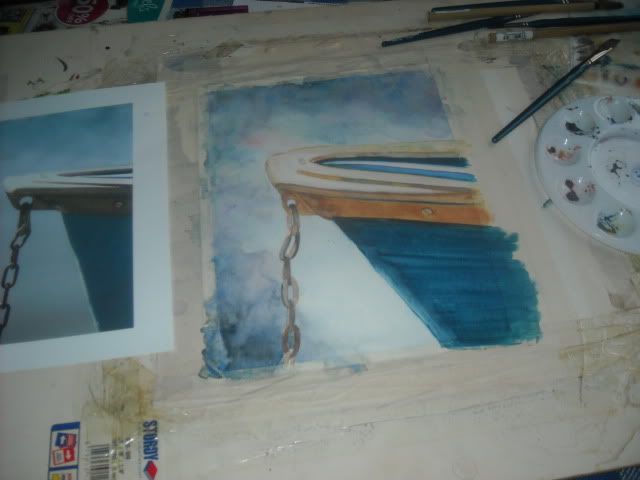 Finished product: 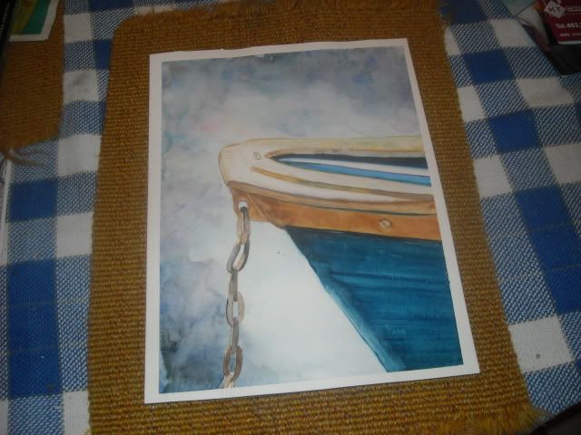 |
|
|
|
Post by Kerit on Nov 28, 2010 22:22:15 GMT -5
Nice! I sometimes find it difficult to judge from a photo, because it tends to read differently than a scan, and of course both can be so different from viewing the actual piece with your own eyes.
If I had to critique, I think what steps out at me is the hull, because it reads more like a brush stroke than wood grain or paint. It's just a little less believable when compared to the tan/gold rim (whatever part of a boat that is). However, that could be the whole photo-of-a-painting thing.
I really like the negative space you've left between the boat and chain, rather than making it as flat of a color as it seems in the photo. It's also the strength of that contrast making the line of the hull seem less defined.
The very bottom link of the chain also seems unfinished to me, I think because the blue background and the chain foreground aren't meeting. I was often nagged by professors to not quit too early on a painting and leave uncertain details, so that's where that comes from.
Overall, it's great! We should start an art group, or do a trade!
|
|
|
|
Post by katt on Nov 28, 2010 22:28:37 GMT -5
I like your version better than the original. I agree with the part about the blue wood, but in the original it doesn't look like wood. I think you could make it look like wood by adding some lines for wood planks and a little more texture. It looks pretty good as is though - I don't see "planks" in the original or anything so yeah.  My only real input would be the chain and the background. I think making the background a little darker closer to the boat - not a whole lot, just a bit, and especially at the bottom between the chain and the boat. Then the chain, the first link (not the ring on the hull, but the first link hanging from that that is at an angle) doesn't look quite right. Like it looks pear shaped, as opposed to an oval or rounded rectangle. This makes the chain appear to be hanging strangely. It looks really good though, I love the colors.  |
|
|
|
Post by sherrylynne on Nov 28, 2010 23:29:47 GMT -5
Thanks This is what I'm looking for! And Kerit- now that I look at it, I can see I must have missed the fact that the masking must have covered the entire last link, rather than leaving a space(which I obviously didn't finish . I did leave no wood grain simply because there wasn't any in the original. |
|
|
|
Post by katt on Nov 29, 2010 4:06:40 GMT -5
Thanks This is what I'm looking for! And Kerit- now that I look at it, I can see I must have missed the fact that the masking must have covered the entire last link, rather than leaving a space(which I obviously didn't finish . I did leave no wood grain simply because there wasn't any in the original. I get tired of it when I show people art asking for an opinion and all they say is "looks good!"  It's like well I worked on it for several hours, it is supposed to look good, but how do I make it BETTER? I use my Mom. She has no issue critiquing me. She usually has good input too. |
|
|
|
Post by Kerit on Nov 29, 2010 9:28:08 GMT -5
Bah, I didn't quite articulate my thoughts on the hull. It's not that I want to see wood grain or some other material that one automatically expects a boat to be, but my brain doesn't want to think "brush stroke" when I see it. Of course, leaving visible brush strokes for a more "painterly" mood is not at all bad thing, it just doesn't quite jive with the believability of the remainder of the piece in this particular instance. The technique you used on the background works just fine! Am I making any sense? It's kinda early in the morning yet and I've had no tea. My husband and I have similar degrees in art. I am his harshest critic, by far... I feel like I'd be doing a huge disservice by not sharing my exact thoughts about his work and how it could improve. If he wants to hear "oh, that's pretty, dear!" he can show it to his mother I expect the same honesty from him in return. |
|
|
|
Post by mustelidmusk on Nov 29, 2010 9:46:23 GMT -5
WOW!!! I really like it!
Hmmm.... this is difficult to critique... I know this is weird, but I want to see some context for the boat. For some reason, I want to see the hint of a distant shore line - VERY, VERY subtle. There seems to be the beginning one on the left side of the chain...it reminds me of the tops of trees in the fog...grayish in color with perhaps a hint of mauve. I'd like to see a pale hint of that used to define a a faint shoreline with trees Then I MIGHT make the color on the left side of the chain "blend" a little more closely with the rights side of the chain. I would still retain some of the white, but the left and right side of the chain would seenm to transition more smoothly to white area, which would then be a bit smaller.
I have such an issue with backgrounds in my own work- mine always suck. I painted a crow - like the crow, but the background is terrible/boring. I ringe every time I see it. I liked the crow , and I was afraid I'd ruin the painting --- and I did - LOL!!!!
-jennifer
|
|
|
|
Post by shilohismygirl on Nov 29, 2010 9:50:29 GMT -5
I wish I were a person that knew even the slightest about critiquing art. I am not. However, I LOVE your watercolor. To me, it looks as good or better than the photo. You're a great artist!
|
|
|
|
Post by sherrylynne on Nov 29, 2010 10:58:22 GMT -5
Shilohismygirl- Thank you! Kerit- Thank you! And yes, you make a lot of sense, tea or no I still have to learn how I want to interpret a picture, instead of simply copying it. Right now, I'm kind of at that in between point, between learning what has to be kept somewhat truer, and when to be more...creative about the whole thing Jennifer- I see what you mean about wanting some sort of context. Looking at it again, it really does need that. What I love about watercolours is the way the water works either for or against you, depending on what you do. And although previously all I did was still life, I really have been wanting to pick up the brushes again, and give it another shot! |
|
|
|
Post by Kerit on Nov 29, 2010 13:55:50 GMT -5
I do like Jennifer's suggestion. It wouldn't have to be the actual shape of anything recognizable... just a hint of horizon or shoreline. You're so right about watercolors. I often become frustrated with them because the sort of mistakes I make seem so very hard to fix. I prefer acrylics for their drying speed, and the ability to layer them and manipulate layers. I do remember working on a still life with charcoal, and trying so hard to be "realistic." People are always so wowed by photorealism, you know! Especially when you're first learning, photorealism seems like the ultimate goal. I wanted it to look so exact, and when the still life was done... nobody really liked it. I didn't like it either. That was when I realized... it might look like a photograph, but that doesn't mean it's any good. |
|
|
|
Post by katt on Nov 29, 2010 14:06:34 GMT -5
I have been thinking about trying watercolors sometime this summer. And oils. I have really only used acrylics for painting. And wall paint for murals. lol Up until a few years ago I did pretty much everything in pencil and/or charcoal with the occasional oil pastel. I always tended to veer away from coloring things, because I felt like I ruined them. I think the issue was that as a kid, I would draw it in pencil shading and all, then color it in. Then I would hate it and think I ruined it (which I had). Now I know better, and I really like working with color. Getting a good "sand" color though.....makes me want to rip my hair out. I just have a hard time with getting a good shade of tan. hahaha |
|
|
|
Post by rarnold18 on Nov 30, 2010 0:51:53 GMT -5
I think it's beautiful and your very talented, but I do agree with the others, it needs something in the background to "anchor" the hull of the boat so it's not just floating there in space...whether it's the horizion, a dock, or even a bird flying in the distance.
|
|
|
|
Post by katt on Nov 30, 2010 1:03:23 GMT -5
I think it's beautiful and your very talented, but I do agree with the others, it needs something in the background to "anchor" the hull of the boat so it's not just floating there in space...whether it's the horizion, a dock, or even a bird flying in the distance. I really like the bird idea! |
|
|
|
Post by WTFerret on Nov 30, 2010 12:02:15 GMT -5
I like your version better.
|
|